EGEO 451 - GIS Databases (Winter 2009)
Lab 1 - Using KML Files and Google Earth
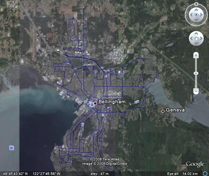
For this lab, I attempted to get some usable archaeological data, but was unsuccessful. This is not too surprising considering that most data regarding cultural resources in the US is considered highly sensitive and not dispersed to the general public. Archaeological GIS data was available for sites outside the US (Africa, Europe, S. America), but I did not know how to convert a .kml file to a shapefile in order to display it in ArcMap. Instead, I decided to use data already available to me in the J: drive, so I would be able to spend more time learning the process of working with KML files and Google earth. I chose a simple dataset, using Whatcom County bus routes, and the city of Bellingham boundary. I clipped the bus routes to the city layer, and added a DEM layer with hillshade effect for the land, and a bathymetry layer for the water to create the ArcMap cartography. I used the 3D analyst tool in ArcMap to convert the bus route shapefile to a .kmz file. The .kmz file allowed me to see my data in Google Earth as well as in Google Maps. Below are screen shots of my data as seen in ArcMap, Google Earth, and Google Maps, respectively.
My main issue was an inability to get the .kmz file to work as a URL so that I could link it directly from this page. perhaps this is an issue since I am using Google sites instead of FrontPage to create my website (and therefore, not using my school webpage), but it seems to me that Google Sites would be the EASIEST place from which to link to Google Earth, since they are both Google products. I was able to make the link work by creating a "ghost" webpage on my student site, and creating a link to that. Another glitch I encountered was that the bus routes were not labeled in Google Earth, but i had them labeled in ArcMap. The drop-down box in GE does allow the user to choose each route and "fly" to it, but it would have been nice to see each route labeled in the big picture. One other notable problem was that the bus route data did not show up in Google Maps. Perhaps the .kmz file I created was incompatable with Google Maps. Otherwise, I have no explanation for this.
Google Earth vs. ArcMap
Google Earth provides an entertaining user experience. Fly-overs, the ability to zoom, tilt, and get a 3D view allows the user to interact with the map. Unfortunately, this experience is only available to users with internet access and Google Earth installed on their computer.
As the cartographer, this was a nice way to be able to check my data for accuracy. Unfortunately, when zoomed in, it was obvious that the ArcMap data did not line up with Google Earth…bus routes were going straight through homes, not lined up with streets. GE must be using a different projection, which would create the need to reproject data first, an unwelcome extra step for the cartographer.
Google Earth does not provide the “what every map needs” essentials. For some applications, this may be acceptable, but it is always preferable to have the scale bar, north arrow, etc. Oddly enough, even though those icons are not present on GE, many other icons do pop up on the map, seemingly unnecessarily. They seem to be added automatically by GE, but are distracting and needed to be physically unchecked to see the information I created on its own.
Google Earth is a great tool, as long as the user is aware of the content and context of the map they are viewing. Otherwise, ArcMap is needed to provide essential information including, but not limited to: metadata, attribute info on the layer, labels, a legend, scale bar, and north arrow. ArcMap may provide less interaction for the user, but it gives the cartographer much more control over the look and feel of the project. In the end it would come down to the cartographer’s preference as to which interface would be most practical.
|
|
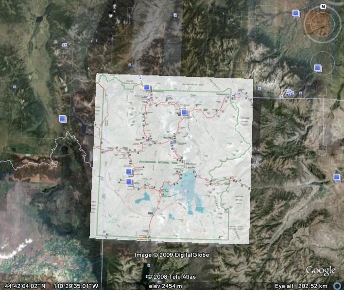
Lab 2 - SDTS and .e00 Files
This lab was an exercise in retrieving and extracting files found through online resources. Both DEM and .e00 files were downloaded from geocomm.com.
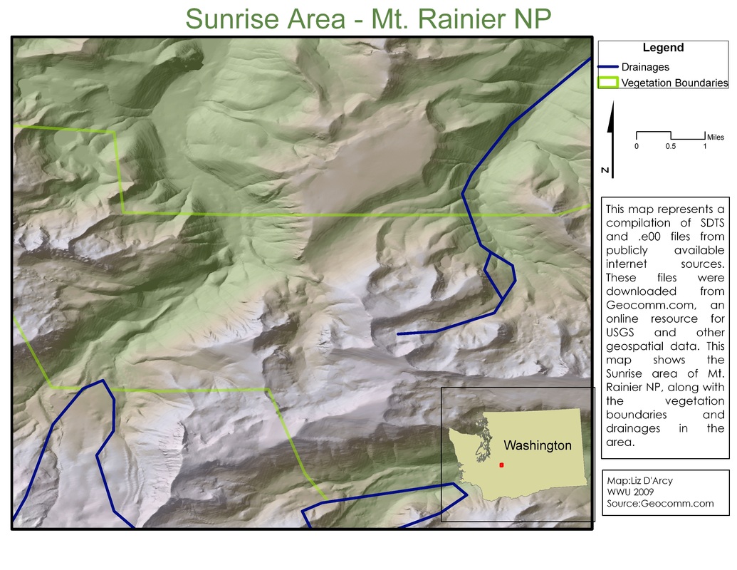
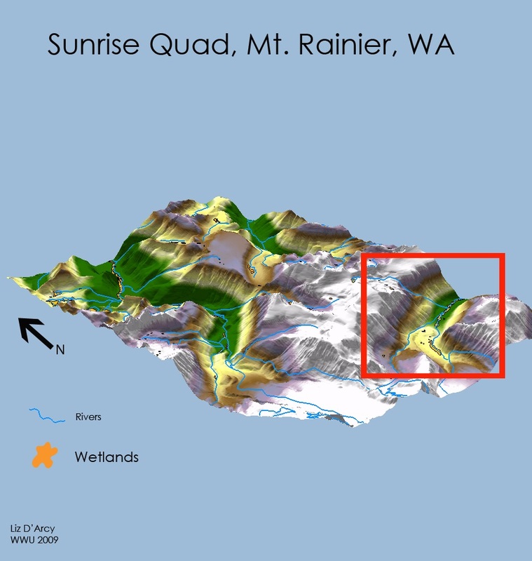
Lab 3 - 3D Presentation of Spatial Data
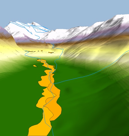
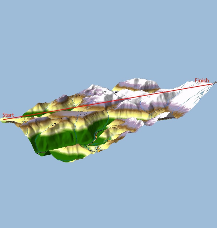
For this project, I continued the map I started in Lab 2, using the Sunrise Quad of Mt. Rainier National Park as my study area. This time the focus was on creating a 3D visualization of a 2D map. My goal was to learn how to use the 3D features in ArcScene, so I selected some simple layers to drape over the Sunrise DEM: a rivers layers, and a wetlands layer. To create the 3D version of the DEM, I used a 1.5 vertical exaggeration, and a custom color ramp. I was pleased with the results this combination gave me. The layers drapes over the 3D scene quite easily, with only minimal manipulation on my part needed for offsets and symbolization (no need to create a .tif file and import that into ArcScene).
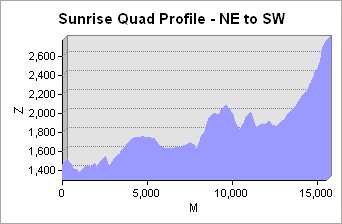
To create a map that told the viewer something about the area, I chose to create two profile graphs of the quad. This area is very popular with hikers, so I thought that showing the viewer the “ups and downs” across the quad would be useful and fun for determining the approximate elevation at any given point along my routes. I used the 3D Analyst tools in ArcMap to interpolate two lines, one NW to SE across the quad, the other NE to SW. I then created a profile graph, and exported the profiles as images so I could display the profile next to the 3D image of the route.
I also used photoshop for this lab to create the legend and other cartographic features in the first map since they could not be created in ArcScene. I don’t have a lot of experience using photoshop, but I was pleased with how the map turned out.
For visual impact, not much can beat a 3D model. It allows the cartographer to get a lot of information across to the viewer, and there are enough tools in ArcScene that it seems you are only limited by your imagination with respect to what can be accomplished with 3D visualization.
|
|
|
|

|

|
Lab 4 - Gathering Field Data with GPS
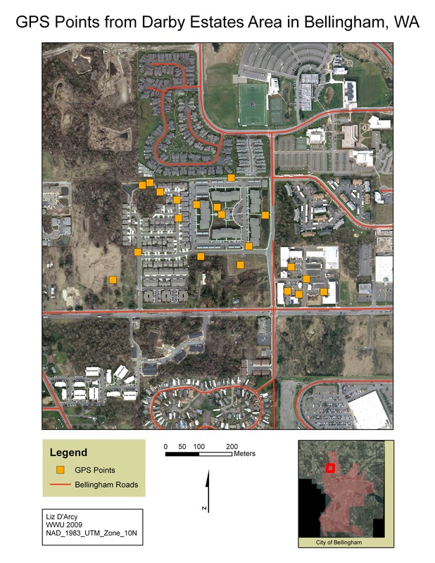
For this Lab, I worked with a classmate to collect at least 20 GPS points in a predetermined area in the city of Bellingham. Each point has two attributes, one noting the Land Use/Land Cover category of a given point. The other attribute (our choosing) was each point's distance from a major road (defined by the Bellingham Roads Layer).
Lab 5 - Creating and Merging Datasets
Part 1 - Displaying Rasters in ArcMap
This is a revised version of the module 2 map. I added cartographic elements to the basic map created during the exercise. I also cleaned up the legend and chose a more pleasing color scheme.
This is a revised version of the module 2 map. I added cartographic elements to the basic map created during the exercise. I also cleaned up the legend and chose a more pleasing color scheme.
Part 2 - Merged Datasets
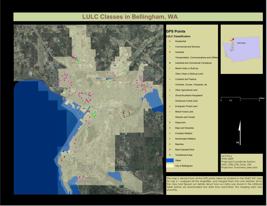
This map is a compilation of the all the GPS points collected by students in Lab 4. In order to maintain consistency from the outset,and facilitate merging of the datasets, we decided as a group ahead of time on the projection that we would use for collecting the points (GPS unit defaults to WGS1984), and what projection we would use to download points (NAD UTM zone 10N). We also agreed that our headers for the attribute table would be "objid/lat/long/code/note". Aside from some minor tweaks, most importantly the elimination of the lat/long headings (that info is already stored in the file and is unnecessary in the attribute table), merging the tables went surprisingly well. Obviously, our work at the beginning to coordinate our efforts made our jobs far less stressful in the end.
I created a legend that I think conveys the information about LULC classifications, without being confusing or unreadable. I gave each primary level its own symbol, and gave separate colors to the secondary LULC levels. All the GPS points are overlayed on an aerial photo of Bellingham, and the City of Bellingham is defined.
Lab 6 - Air Photo Interpretation
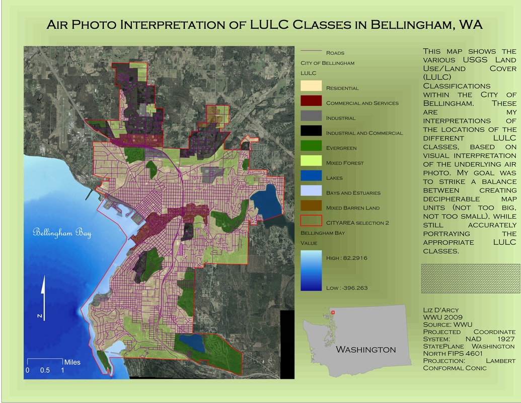
This map is a representation of my visual interpretation of the underlying Bellingham air photo. I have attempted to manually define the USGS Land Use/Land Cover (LULC) areas of the city, balancing clear map units with accurate representation of the LULC classes. Classes were defined down to Level 1 only.
To create the map, I used the air photo from Air_photo_02.sid, and the neighborhood shapefile (excluding the Urban Growth Area).
I ended up with approximately 60 polygons, which seemed to create a nice visual representation of the LULC classes. There were two areas that did not have polygons when I was finished, so I had to create polygons for those two areas. Maybe I needed to use topology for this lab…??
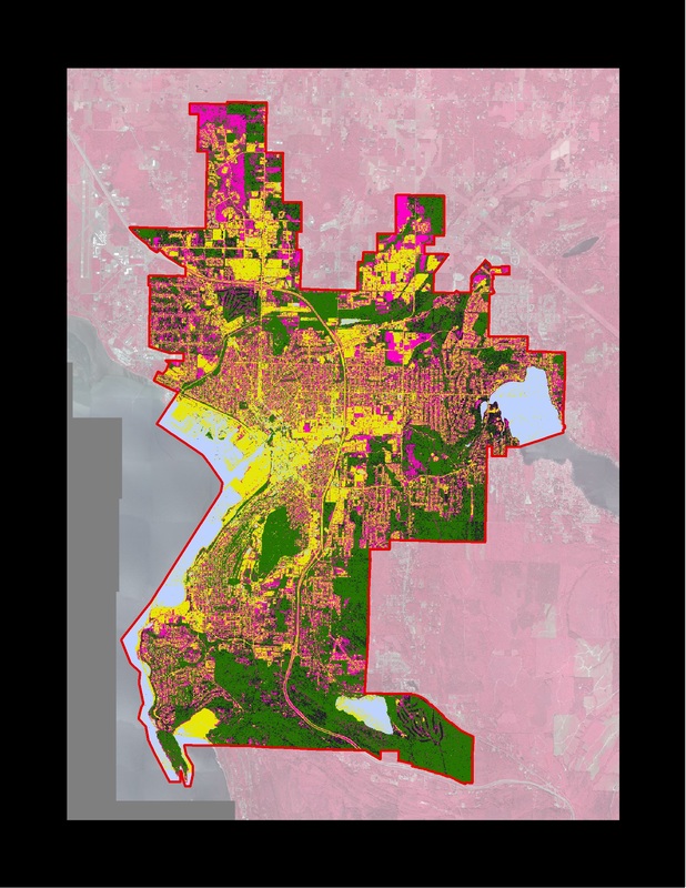
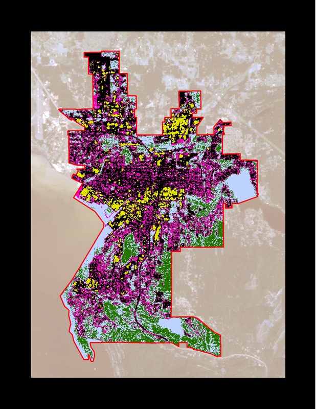
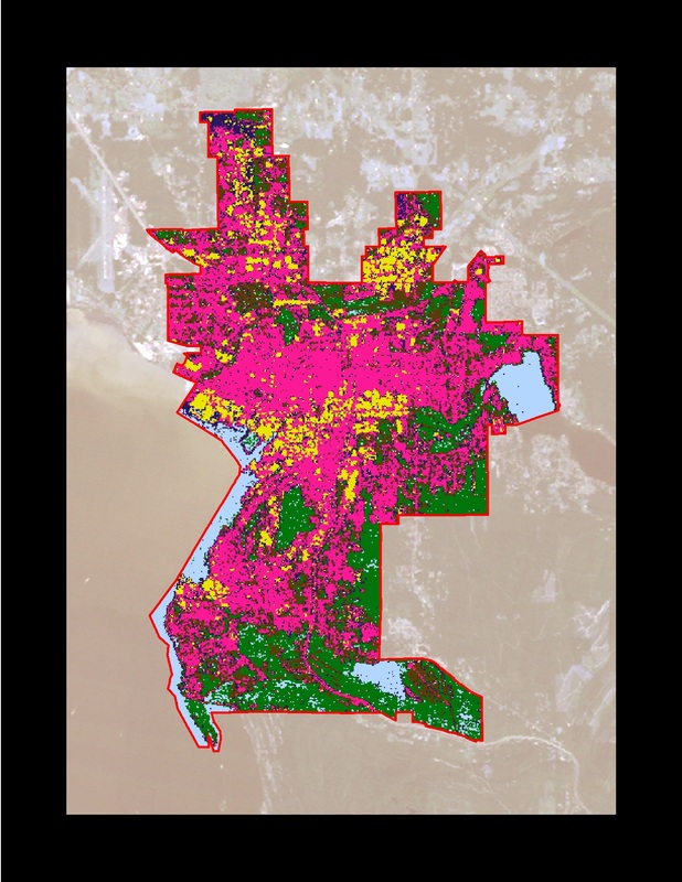
Lab 7 - Remote Sensing Classification
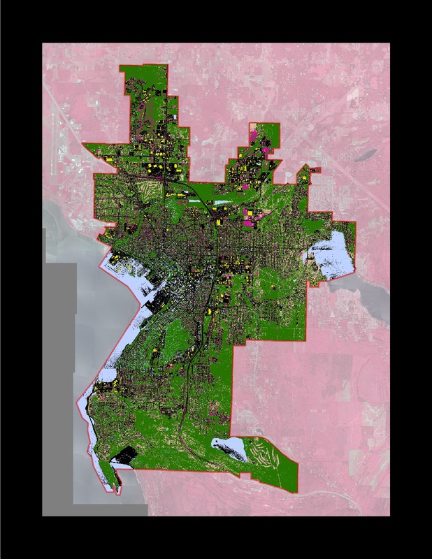
This lab allowed us to dip our toes into the ocean that is Remote Sensing. We were given two different ways to analyze two different resolutions of Bellingham Air Photo - unsupervised and supervised. The high res images are 1 meter resolution, the low res images are 30 meter resolution.
I created these maps using the air photos which I then clipped to a city of Bellingham layer using the "extract by mask" tool. The classifications were easy to run in ArcMap using the Image Analysis tool, regardless of the area or resolution being classified. I chose to use the recommended 16 classifications. Doing more than 16 did not seem to benefit the map's accuracy, and the system crashed when I attempted classifications over 22.
The challenge for this lab was interpreting the maps after running the classification tool. Many areas showed up as LULC classes that they clearly were not (i.e. roads showing up as water). I can only attribute this to the way I understand remote sensing to work - the reflexivity of certain areas (roads) resembles other areas (water) enough that the computer recognizes them as such. As you can see, no matter which technique I used, the most LULC classes I could get was 6. Very little land showed up as rangeland, making that category almost negligible.
High Res vs. Low Res
Initially, I assumed that the high res images would be far superior in classifying LULC areas (high res = better!!). But this theory did not hold true. It turns out that sometimes bigger pixels are better. The high res images tended to be overly busy, but not necessarily more accurate. Once again, the determination about which resolution to use would depend on the needs of the project or client.
Supervised vs. Unsupervised
Supervised classification was difficult, only because (as I noted above) certain areas are so small as to render them almost negligible. Trying to to create a training polygon for this type of LULC was a challenge, especially with the low res image (too little distinction for the computer to distinguish between areas...?). I can see now that I could have obtained even better results with the supervised classification had I created more training polygons, as it turned out I only created about 8.
High Resolution Unsupervised Classification
|
High Resolution Supervised Classification
|
Landsat Unsupervised Classification
|
Landsat Supervised Classification
|
Accuracy Assessments
I ended up doing these assessments manually, since I am not familiar with ERDAS and could not get any other method to work. That method was fine, it just took a little extra time and effort. Both maps were compared to points collected and classified in Lab 5.
I used the 30 meter unsupervised map for the first accuracy assessment because I thought it was my most accurate map. Overall, the accuracy was 53.60%, which seems low to me. i attribute this low result to the fact that when people when out and collected points, they were attributing a code to the exact spot on which they were standing, whereas a 30m resolution air photo cannot distinguish that finely.
For the second assessment, I used the map created in Lab 6 for comaprison. This map's accuracy was much higher (72.4%), a fact I attribute to the accuracy I was able to achieve when I originally created the map. The points tended to match up quite well with my air photo interpretation, so I think the human factor in this exercise is important....sometimes the computer (remote sensing) can't distinguish what the human eye can.
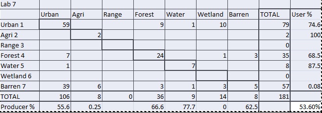
This matrix represents the accuracy for the 30 meter unsupervised map when compared to the points collected during Lab 5.
|
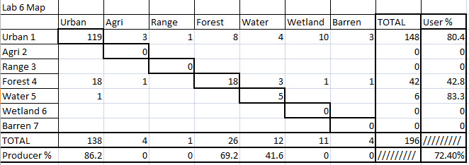
This matrix represents the accuracy for the map created during Lab 6 when compared to the points collected during Lab 5.
|
Lab 8 - Using Microsoft Access
For this lab, we worked with Access in order to create forms and databases that allow the user to change information and also add that data to an ArcMap project.
Even though I have no previous experience with Access, I can see how incredibly useful it can be for certain applications. Preventing outside users from changing important data, while still allowing them to add in needed information is exactly what I would like to do for the archaeological site I am working on for my thesis.
For this lab, I had a hard time getting the data to work in Access, and had to try several permutations over the course of several days in order to get the program to accept the data I was trying to use. I think most of my problems stem from the fact that I have absolutely no prior experience with Access and therefore did not know what I was doing wrong or how I could remedy the situation.
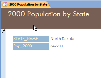
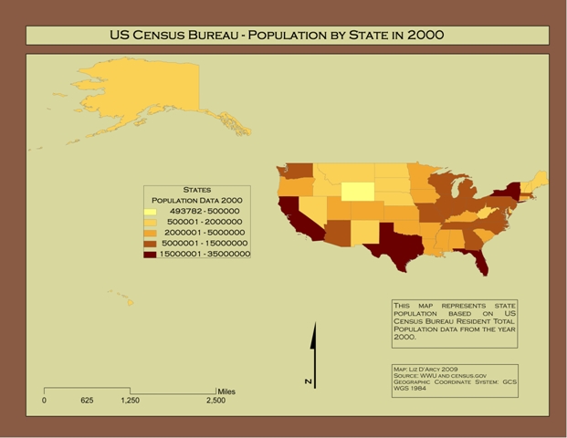
The data I found that worked was unfortunately rather pedestrian...population data from the 2000 census. No cool analysis of changes in forest sizes or rainfall data for me :( But it worked, and that was half the battle! I was able to create a table that would allow a user to change population data by state. This automatically added the data to my shapefile (I had added a new field in the attribute table for this purpose). The resulting map showed the new population figures I created in Access.
For part two I created a new table, which I then populated with the information from my census data (I imported this directly to the table from an excel spreadsheet). This table was joined with my existing shapefile using the join tool, which created the same map, just in a different way.
I found the second way to be easier to use, since I was able to import the data directly using my excel spreadsheet. However, I think for the application that I would use it for, the first way would be more useful. Certainly for any data that is changing or need to be updated, the first method would be much more useful.
I hope to learn more about Access over the next quarter so I can use it for my site, creating a database that others can add to over the course of many years.
Even though I have no previous experience with Access, I can see how incredibly useful it can be for certain applications. Preventing outside users from changing important data, while still allowing them to add in needed information is exactly what I would like to do for the archaeological site I am working on for my thesis.
For this lab, I had a hard time getting the data to work in Access, and had to try several permutations over the course of several days in order to get the program to accept the data I was trying to use. I think most of my problems stem from the fact that I have absolutely no prior experience with Access and therefore did not know what I was doing wrong or how I could remedy the situation.
The data I found that worked was unfortunately rather pedestrian...population data from the 2000 census. No cool analysis of changes in forest sizes or rainfall data for me :( But it worked, and that was half the battle! I was able to create a table that would allow a user to change population data by state. This automatically added the data to my shapefile (I had added a new field in the attribute table for this purpose). The resulting map showed the new population figures I created in Access.
For part two I created a new table, which I then populated with the information from my census data (I imported this directly to the table from an excel spreadsheet). This table was joined with my existing shapefile using the join tool, which created the same map, just in a different way.
I found the second way to be easier to use, since I was able to import the data directly using my excel spreadsheet. However, I think for the application that I would use it for, the first way would be more useful. Certainly for any data that is changing or need to be updated, the first method would be much more useful.
I hope to learn more about Access over the next quarter so I can use it for my site, creating a database that others can add to over the course of many years.
This is an admittedly terrible map. My apologies!
|
|